Ravens Apothecary & Curios brand design
A distinctive new identity for an independent Whitby business
Ravens Apothecary & Curios is an independent shop in Whitby specialising in alternative gifts, witchcraft supplies, herbs, crystals, candles and hand-crafted curios.
I created a new visual identity that reflects the character of the business, combining a dark, slightly folkloric feel with a strong, recognisable design that can work across everything from shop signage and packaging to social media.
The brand Design Brief
The identity needed to feel distinctive and alternative without falling into the usual gothic and witchcraft clichés.
The raven was an important part of the business and needed to remain at the heart of the identity, while the overall design had to have enough character to reflect the unusual range of products found inside the shop.
It also needed to be practical. The finished identity would be used at very different sizes and across print, digital, signage, packaging and social media, so a single logo was never going to be enough.
Design & Development
Creating something recognisable
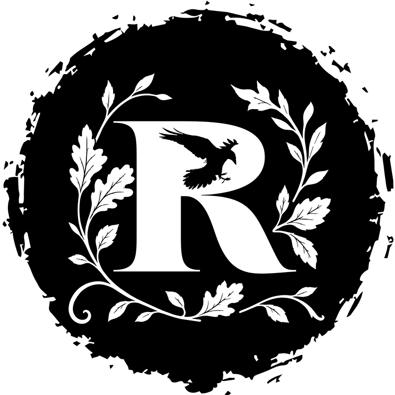
The identity brings together a raven, the letter R and natural foliage to create a mark that feels connected to the name and personality of the business.
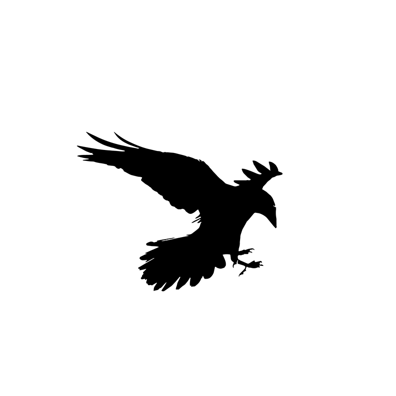
The raven is incorporated directly into the letterform, making it part of the logo rather than simply an illustration sitting alongside it. Leaves and branches add an organic, slightly folkloric quality inspired by the natural and spiritual products sold by Ravens.
A deliberately imperfect finish
Rather than creating something overly polished, I introduced a rough, hand-printed quality to parts of the identity.
The distressed outer frame contrasts with the cleaner typography and detailed foliage, helping the brand feel established, individual and a little mysterious without becoming overly theatrical or stereotypically gothic.
Designed to work in different formats
A good identity has to work wherever the business needs it.
Alongside the main landscape logo, I created portrait, square and simplified versions, allowing the identity to adapt to signage, packaging, stickers, labels, social media profiles and other applications.
Black-on-white and reversed white-on-black versions give the brand further flexibility while keeping the identity consistent and immediately recognisable.
What the Brand Identity Includes
- Bespoke Ravens Apothecary & Curios logo design
- Main landscape logo
- Portrait logo variation
- Standalone Ravens R brand mark
- Social media profile icon
- Black-on-white logo versions
- Reversed white-on-black versions
- Flexible artwork for print and digital use
- A visual style suitable for packaging, signage and promotional material
The outcome
Ravens Apothecary & Curios now has a strong visual identity that feels individual to the business and gives it a much more distinctive presence.
The combination of the raven, botanical details, typography and distressed graphic elements creates a brand that feels alternative, slightly mysterious and rooted in folklore, while still being clear and usable across everyday applications.
Most importantly, the identity is flexible. Whether someone sees the full Ravens Apothecary & Curios logo on shop signage or simply the raven R on a social media profile, the brand remains instantly connected and recognisable.
A brand designed to stand out
Creating a logo is only part of creating a successful identity. The aim was to give Ravens a visual system that can grow with the business and remain consistent across everything customers see.
Have a project in mind?
Book your free 30 min intro call
A 30 min consultation to understand your business and goals.
or text/ whats app / call 07368 392 650